The first step toward building a data culture is to make data accessible to everyone in your organization. Analytics dashboards are a great way to whittle your huge mountain of data down to a manageable — and an actionable — molehill. A dashboard is one of the easiest ways you can make data digestible and more fun (yes, fun) for every member of your team.

What Is a Dashboard?
A dashboard is any way of displaying data in a meaningful way. It's not a specific set of data, but rather a framework that you can easily pull data into and make it easier to understand. In this post, we're going to walk through creating dashboards in Google Analytics — but hopefully there are takeaways that can also apply to other online tools you may use.
Identify Nice Versus Necessary Metrics

Before you even think about touching a custom dashboard, you'll need to do some serious thinking about what metrics are most important to you. Identify the KPIs (key performance indicators) that are the best proxies for your mission. These should be the data outputs that best predict your desired organizational outcomes.
If your organization is hoping to raise awareness about a health-related cause, you might value downloads of informational pamphlets, views of an educational video, or signups to an informational newsletter. If you're seeking corporate sponsorships, you might prioritize submissions of a corporate inquiry form. Identify the most important pieces of information that you'll want to check regularly.
Build a Feedback Loop
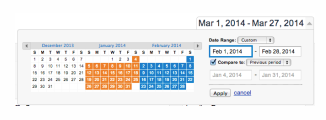
Once you build the dashboard, you can automate it to send daily, weekly, or monthly reports (we'll get to that in a bit). You may only need an update on referral sources every month, but maybe you want to check your site's top content posts every week. No matter what your KPIs are, we recommend choosing a date range that also includes a comparison to the past time frame for your scheduled emails. After all, a number without context has little meaning.
Customize by Department
Different team members have different priorities. So, if you're building dashboards for other members of your team, you'll want to consider the unique KPIs and time frames that will be important for them. (Personalization is key to killing data fiefdoms.)
For example, you might want a weekly AdWords report for your marketing team. Then maybe you want a weekly content performance report for content writers, or a monthly social media report for your communications team. Customization is crucial for bringing your team to the table.
0 to 60 in 20 Minutes
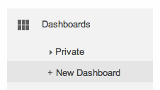
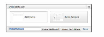
In Google Analytics, the first item in the left menu should be Dashboards. Click to create a New Dashboard. Choose whether you want a blank canvas or Google's Starter Dashboard (we recommend the latter for beginners). Give it a title and click Create Dashboard. Boom! Instant dashboard.
Now you need to customize this dashboard based on the KPIs you've chosen. Each widget on this page can be edited by clicking the editing button in the top right corner. This button will open the widget settings, where you can completely customize what is displayed.
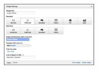
- Standard versus real-time widgets: Choose the display method that makes the most sense for the metrics you're displaying. If you want to show the raw number of visitors that week, use Metric. If you want to show bounce rates for a list of different content pages, use a Table. Play around to find the best way to display the data.
- Metric: Find the metric you want to display (page title, time on site, bounce rate, and so on). For help in decoding Google Analytics terms, here is a helpful glossary.
- Compare and filter: This is where you can really drill down into the data. For example, if you're making a mobile traffic dashboard, you'll want to filter each widget to only show mobile traffic.
- Link to report or URL: This will make it easy to find relevant reports when you want to dive deeper from a given widget.
- Clone: You can clone a widget to maintain all of the settings you've made. This is helpful if you want to make another very similar widget.
Google Analytics will let you add up to 12 widgets to each dashboard you create.
You can customize the number of columns and their widths by clicking Customize Dashboard underneath the date selector. Then, drag and drop the widgets to display them in the order that makes the most sense.
You'll also notice that when you're in reporting view, you'll see the Add to Dashboard option at the top of most reports. This option is another way to configure a report and add it to a dashboard, which may be a little easier if you're not quite comfortable with the widget editor.
Automating Dashboard Emails
With Google's automation feature, you can easily set up automatic emails that will attach your dashboard report as a PDF. Just click Email at the top of the dashboard, and you'll see this screen:
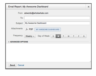
Select the frequency and day of the week you'd like your team to receive the dashboard. Google will automatically create an updated report according to your specifications and attach it to this email as a PDF. You can set an end date for the automation under Advanced Options.
Copying Dashboards to Different Views
You can share a dashboard with others, or copy it to use for other Google Analytics profiles you manage. (Remember, the dashboard doesn't actually contain your data — it's just a framework.) Just click the Share button at the top of the dashboard.
In the spirit of sharing, here are some of our favorite dashboards from Whole Whale. (You might need to sign up for Google Analytics to see them.)
Google Solutions Gallery
The Solutions Gallery is a resource that contains pre-made dashboards that others have shared with the Google community. You can browse these for inspiration or import them when you're adding a new dashboard. A word of caution: no off-the-shelf dashboard will be completely in line with your organization's unique needs. So if you use a dashboard from the Solutions Gallery, think of it as a starting point and make sure to customize the widgets.
Go Forth and Dashboard
Dashboards are to data analysis what free coffee is to Monday morning meetings. They help lure people in and get them excited about something they're otherwise a little leery of. Creating effective dashboards is a crucial — and pretty straightforward — step toward building a data culture. Here are some final tips:
- Check if people are opening and using regular dashboards by adding a Bitly link that links to the shared dashboard. You can see the click stats for any Bitly link by appending it with +.
- Turn off the dashboard randomly to see if people miss it.
- Change up the subject line and refresh the copy in the scheduled email.
- Encourage and celebrate when people ask deeper questions of the data.
Additional Resources for Nonprofit Website Management
- Register for Google Analytics 101 and 201.
- Learn How to Improve SEO Keywords for Nonprofits.
- Get tips on How to Choose a CMS for Your Nonprofit.
- Check out E-Commerce for Nonprofits: Going from Beginner to Pro.