

This year, it's more important than ever to ensure that your organization has a high-quality and well-functioning website. As events, conferences, and fundraisers move onto digital platforms, your website needs to be a hub for information, donation funnels, and effective interaction. Whether you have an existing site or are starting from scratch, here are the top four trends to incorporate into your site in 2021.
1. Develop Intuitive Navigation
Who is your audience and what actions do you want them to take? These questions should be in the front of your mind when creating and implementing a strong and effective digital strategy. Your website, as the essence of your digital presence, should reflect the user journey of potential donors, volunteers, and other stakeholders. Most visitors will abandon a site if they cannot find what they are looking for within a few seconds of landing on the page.
Quick tips:
- Navigation bar: A visible top navigation bar should be available on all pages — except the donation page (more on this later).
- Simple language: Page titles should be kept short within the navigation. Nothing should be labeled with niche jargon or language that a wide audience couldn't comprehend.
- Hierarchical content: Ask yourself which pieces of content are most important for your visitor to interact with before they're empowered to take the goal action. Each web page should push to a logical next step, be it an action, a downloadable piece of content, or another web page, that helps your user in their journey.
- User-based site map: Your content hierarchy should also determine how you set up your site map. Auditing your site map will help to ensure thoughtfulness in how your website pages are categorized and linked. A user-based, intuitive site map will greatly affect the overall user experience and effectiveness of your website.
- Search box: Including a search box in a prominent area, usually the top header, allows visitors who have come to your site for a specific purpose or answer to find those responses quickly. Bonus: Setting up tracking on this search bar can give amazing insight into what visitors are interested in, what your navigation may be missing, and the types of content you should consider developing.
Unsure of your user journey or how to determine your target audience? Request a Website Wellness Consultation.

2. Build Clear Calls to Action
If your intuitive navigation reflects the actions you want your audience to take, creating direct and clear calls to action, or CTAs, reflects how your audience should take those actions. CTAs are links built into your site, often in button form, that direct visitors to achieve an end goal such as making a donation, filling out a form, registering for an event, or another transactional activity.
Quick tips:
- Use action-based copy like "donate," "download," or "request."
- Design the buttons using easy-to-read fonts and colors.
- Position your CTAs in prominent places on your website, usually above the fold.
- Include a quick value proposition and sense of urgency: "free," "today," or ‘"now!"
Additionally, don't distract the visitor by offering too many CTA options. Prioritize the most important actions and base the design around achieving that goal. As a rule of thumb, each landing page should have only one CTA goal. A main page might have two or three, such as a donate button, a newsletter subscribe button, or a volunteer button. When this is the case, use different areas of the page so the visitor's eye doesn't catch more than one at a time.
3. Plan Around Responsive Design
Did you know that more website traffic originates from mobile devices than from desktops? With this increase, we've seen a shift to incorporate "responsive design" or "mobile-optimized design." Responsive design means that the elements and layout of your site adapt to the size of the screen that it is being viewed on.
A responsive and mobile-optimized design ensures that your site is impactful, helpful, and usable for all visitors, regardless of their device. These terms and their implementation weren't coined until 2010. If your site was built before that time, there's a good chance that your site isn't built using responsive design.
If your site doesn't work on smaller screens, it might be time for a redesign. Experts recommend a website redesign every three or four years to keep up with changing technology and standards. TechSoup offers many web development services for nonprofits, which you can check out by clicking the link below.

The best way to plan your web design around changing screen sizes is to always have a clear goal for each page. This way the page is still impactful on small screens because there's only one focus. The most effective sites seamlessly transition between screen sizes because they were built deliberately to keep the message, goals, and desired actions of the site as straightforward as possible. As the size of the screen decreases, as does the amount of content on the page. Mobile users not only have less space, they also typically have more distractions. Less is more for smaller screens.
Quick tips:
- Determine if your site works in multiple screen sizes by visiting it on your mobile device, tablet, and desktop.
- Focus on a single goal or target action.
- Lead with mobile in mind when planning a web redesign or rebuild.
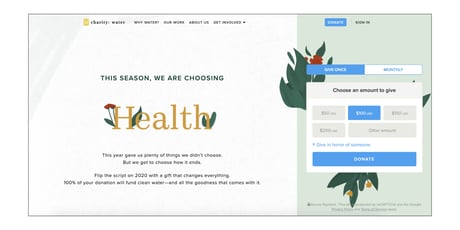
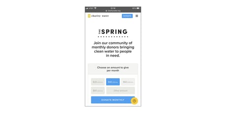
Here's an example of a site built using responsive design. charity: water has a single goal for its homepage — encourage donations. Regardless of desktop or mobile, the page still accomplishes that goal and does so in a way that meets the visitor where they are. On mobile, the copy is reduced, distractions are limited, and the donation section is prominent.
4. Simplify Your Donation Page
One of the most important aspects of your nonprofit's website is a streamlined donation page. Many organizations are having to quickly adapt to a loss of donations from in-person events and fundraisers. Whether or not you have an existing digital donation platform, it is important to make sure that you follow certain best practices while you improve or develop your page.
You'll want clear calls to action throughout your site that point to the donation page. For best results, you can test putting these buttons in the following locations:
- In the navigation bar
- In the footer
- In-line throughout web pages — especially your mission or about page!
- On a pop-up
- Within the header image or banner
When a person reaches the donation page on your website, the hardest part of the process has already been completed. That visitor trusts your organization, has decided to seek out your website, and has taken the goal action of making a donation to your cause. With all that accomplished, design your donation page with one word in mind: simplicity.
On the donation page, there should only be one action a visitor is able to take — completing the donation. This can be encouraged by implementing some simple best practices.
Quick tips:
- Eliminate links: Your donation page is one of the only places on your site where it's better to have no links or distractions. Every link on your site points to an action; on the donation page that action is being taken. The goal has been hit! Kind of … so long as the potential donor doesn't get distracted on this key final step.
- Remove the navigation bar: Yup — no links means no links, navigation included. You can maintain a header for uniformed branding, but eliminate aspects that promote navigation off the page.
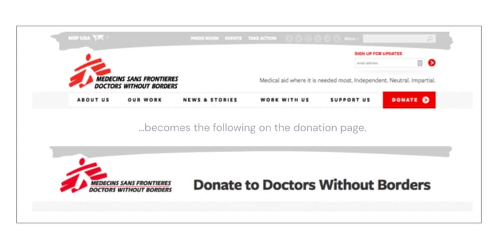
- Limit imagery: If you choose to use images, be sure to use only one or two maximum. The images should support your value proposition and encourage donation. If the image is distracting or has text, consider removing it.
- Reduce text: Most visitors know exactly what they will find on a donation page. If they're landing there, it's no accident since they've probably already decided to make a donation. If you include text, use it as an opportunity to quickly reiterate your mission or reiterate the value proposition.
- Use as few fields as possible: Avoiding unnecessary fields within the form helps to lower the barrier of time needed to accomplish the goal. Don't overwhelm the donor with extraneous questions. This isn't the time to ask them to subscribe to an email list or for additional properties to help the marketing team. Name, information needed for the financial transaction, email address — simplify, simplify, simplify!
In summary, fewer distractions, more actions! How can we achieve our goals in a strategic, effective way? Whether that's through intuitive navigation, CTAs, or content planning — what we're really talking about is simplicity. Use a top-down approach to direct the creation or redesign of your website. Start with the end goal and structure everything else around driving that action.
Still looking for ways to improve your nonprofit site? You can sign up for a 30-minute Website Consultation for a more in-depth and personalized look at actions you can take to improve your organization's website.
Additional Resources
- Take a TechSoup course on Web Design Best Practices.
- See a webinar on How to Develop a Nonprofit Website Strategy for the Road Ahead.
- In another webinar, get 27 Ways to Improve Your Website Immediately.
- Get answers to How Can I Improve SEO for My Nonprofit Website?
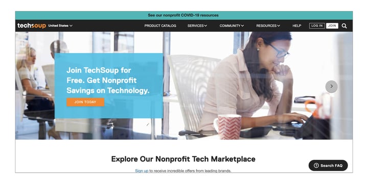
Image 1: TechSoup
Image 2: charity: water
Image 3: Doctors Without Borders