This blog post is more than five years old. It may contain outdated information or refer to products that are no longer available.
So much data is available to your nonprofit — through your CRM, Google Analytics, social media analytics, email analytics, and beyond. When you make a dashboard, the goal should be to deliver the right data from the right time frame to the right people so that a business decision can be made. Here are the three most effective types of nonprofit dashboards, and how to build each one on a budget.
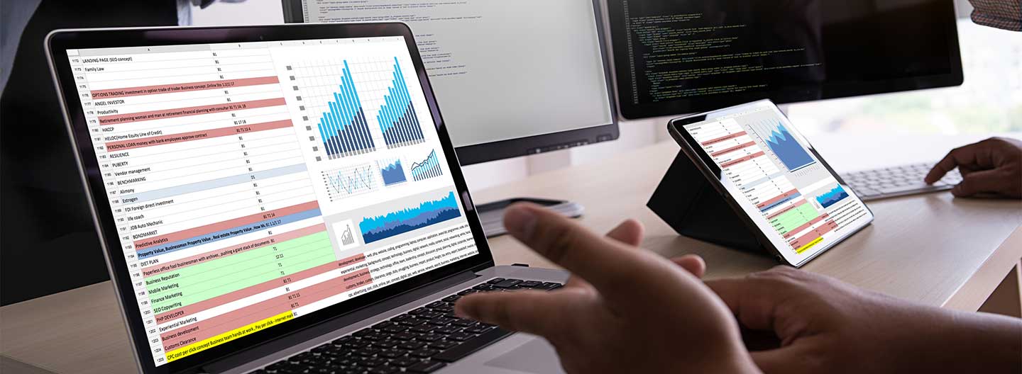
What Is a Dashboard?

We covered Google Analytics dashboards for TechSoup last year. Whether you're using Google Analytics or not, a dashboard is any way of displaying meaningful data in a meaningful way. It's not a specific set of data, but rather a framework that you can easily pull data into and make it easier to understand.
Before you even think about creating a custom dashboard, you'll need to do some serious thinking about what metrics are most important to you. Identify the KPIs (key performance indicators) that are the best proxies for your mission. These should be the data outputs that best predict your desired organizational outcomes.
Broadly, we can categorize nonprofit dashboards into three types:
- Strategic or business intelligence dashboards
- Operational or accountability dashboards
- Analytical dashboards
1. Strategic or Business Intelligence Dashboards
Business intelligence (BI) dashboards track KPIs of departments within an organization — or the organization as a whole. These may be revisited on a monthly, quarterly, or annual basis. Strategic dashboards can be shared internally, or externally as a report for stakeholders. The following are some types of strategic dashboards.
Program Impact Dashboard
What It Is: Ideal for board members, investors, and the public, this is a summary of KPIs and other leading indicators around programs and outputs. These can include on-the-ground work as well as digital impact.
How to Build: Connect the data needed for KPIs via an API or dynamically integrate it via Google Sheets. This will make updating easier. Keep costs down by laying out data in a tool like Google Data Studio or Microsoft Power BI, or see below for more tool options. Once the dashboard is set up, you can take screenshots to make presentations or PDFs.
Key Metrics: Quantity of services, reach, quality score of services, delta over time period, KPI inputs, KPI outputs.
Annual Report
What It Is: Annual (or even quarterly) reports build a narrative around the major "north star" metrics of an organization. They tell a story of financial health, impact reach, and growth of the organization, while layering in stories from the field and reiterating organizational mission and vision.
How to Build: Many organizations go with a designed PDF, custom bootstrap HTML solutions, or long scrolling (parallax) template sites on SquareSpace. These take serious time to design and produce. Our recommendation is to focus your nonprofit's dashboard time on building something smarter and more dynamic. From there, you can take screen captures for snapshot reporting.
Key Metrics: Organization-level metrics (north stars), audience reach, regions, organizational health indicators, programmatic growth.

2. Operational or Accountability Dashboards
These dashboards show the data of now, helping keep the trains running on time within your organization. Accountability dashboards give a view of information needed on a daily or weekly basis, like a running total of ad spends, sales interactions, user support tickets, staff activity, web data, or social activity. Here are five common operational dashboards for nonprofits.
Financial Dashboard
What It Is: Balance and income statements don't tell the full visual story needed when it comes to finances. Use dashboards to visualize your nonprofit's budget shortfalls or windfalls and to create a fiscal narrative for your team.
How to Build: Leverage the dashboards connected with the source of data. Export data through Microsoft Power BI or through an API to dynamically update content in the system.
Key Metrics: Performance trends year-over-year, breakdown of revenue per expense sources, ROI, efficiency metric (impact per dollars), key financial indicators.
Fundraising Donor Dashboard
What It Is: The story of lifetime donor value and retention can be lost in spreadsheets. Exploring and visualizing donor data can reveal key insights that will inform fundraising strategy.
How to Build: Max out the configuration of the native dashboards where the data lives. For larger periods of analysis, consider exporting, exploring, and visualizing data with Fundraising Report Card.
Key Metrics: Year-over-year trends, breakdown of retention, gift size, net worth, and giving ROI based on marketing, emails, and advertising.
Nonprofit Volunteer Dashboard
What It Is: Visualizing the impact of volunteer activity can help motivate volunteers as well as tell the story of impact for a nonprofit. This can also be a helpful tool for identifying areas of improvement.
How to Build: Try to use the native analytics that come with the volunteer management tools being used. If these fail, consider doing quarterly pulls of raw data and building a template in Google Data Studio.
Key Metrics: Total volunteers, total volunteer hours, hours per volunteer, volunteer training time and retention, as well as volunteer attendance at events.
Sales Dashboard
What It Is: Keep track of sales performance by region and salesperson; track projected sales revenue.
How to Build: Try to extend the native dashboards of the database solution. Failing this, Google Sheets has decent graphing tools, and this format will allow quick integration with Google Data Studio. Microsoft Power BI also has great integrations with all major sales platforms and has robust templates.
Key Metrics: Sales leads, weighted value of pipeline, segmentation of lead type and sources, close rates, trends over time.
Staff Performance Dashboard
What It Is: If an organization uses online project management systems, the data may be exported to create a staff accountability dashboard. These can be helpful for managers as well as good for fostering healthy interoffice competition. Whole Whale uses these for our biweekly sprint recaps.
How to Build: Use the native dashboard of the project management tool that your organization uses. If needed, export to Google Sheets and play with in Google Data Studio. Or use Excel and Microsoft Power BI to build shareable dashboards.
Key Metrics: Task breakdown by person, department, and project over time; task type segmentation over time; cost and time per task ratio.

3. Analytical Dashboards
Analytical dashboards show data in a way that allows users to identify trends over time, explore segments, manipulate filters, and search for insights. This requires clean, consistent data that connects with or pairs to the single "source of truth" database, such as Google Analytics.
Web Analytics Dashboard Created with Google Data Studio
What It Is: Create a clean and branded visual of your organization's web behavior for non–data geeks. This format allows you to extract data from Google Analytics and merge with other data sources for a 30,000-foot view of performance. This can also be dynamically updated with given time frames.
How to Build: Google Data Studio
Key Metrics: Segments that include "how good" and "how many" metrics to give tables context (i.e., sessions and bounce rate), conversions for business goals, trends over time, behavioral acquisition. Note that Data Studio can pull in a lot more than just Google Analytics data.
Google Analytics Dashboards
What It Is: Website data is a treasure trove of insights if you're able to pull out the right threads. Creating a focused dashboard of the indicators that matter is the first step to monitoring what matters.
How to Build: Google Analytics. Note that other tools can pull in Google Analytics data. However, as soon as any time frame or segmentation is applied, those tools can't account for the unique cookies of users. In other words, things will break, and numbers won't add up due to absolute unique users.
Key Metrics: Segments that include "how good" and "how many" metrics to give tables context (i.e., sessions and bounce rate), conversions for business goals, trends over time, and acquisition.
Finally … Don't Create Dash-zilla
For any dashboard solution, keep in mind the staff or department that will be using it. People will naturally make a game of improving any number put in front of them, so make sure that the numbers you share internally are the right ones to improve. Don't create Dash-zilla.
Additional Resources: Data Management
- Learn how to Power Up Your Organization's Data with Microsoft's Power BI.
- View a webinar on how to Harness the Power of Data with Tableau.
- Get the Google Analytics 101 + 201 package deal from TechSoup Courses.
- Go deeper into How to Build Google Analytics Dashboards.