All too often we hear new clients claim, "We need a beautifully designed new website."
But your nonprofit's visitors need more than catchy aesthetics. They need to convey personalized information, resources, and services vital to the communities they serve. These five quick and easy design fixes for your nonprofit's website are a great place to start making your website more effective (and yes, more beautiful) than ever.

1. Information by Design
The results from a survey by HubSpot (pictured below) show that visitors value easy-to-find information more than a beautiful home page or super fancy UI-UX (User interface and experience design).
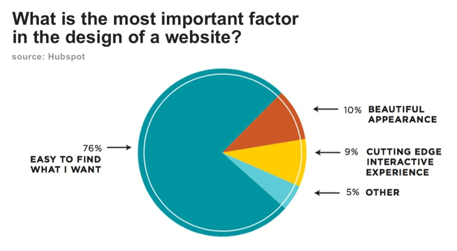
Nonprofit website home pages should look beautiful — no doubt about it. The job of a website designer is to create capsules for your content to convey important information. Far too often, nonprofit organizations place beauty before substance and end up with a fancy-brochure-looking site that doesn't deliver the goods. A well-designed website will tell their organization's story, answer questions, and provide key data that is important for the visitor to digest and act upon.
Quick and Easy Fix
Extend the length of your home page. Answer all your visitors' questions and provide them the information they seek as they scroll down your home page. The most effective nonprofit websites are fabulous storytellers and informational resources.
Check out how the Gates Foundation does a fabulous job of telling its story while conveying data as you scroll down its home page. Each step of the way is filled with beautiful scrollable capsules of photos, messaging, and storytelling. Think about what information your followers are seeking and expand your home page to further engage and inform your visitors.
2. Determine Your Visual Hierarchy
Visual hierarchy is one of the most critical elements behind web design. It's the order in which our eyes perceive what they see. Specific elements of your nonprofit's website are more important than others (membership forms, donate calls to action, your value proposition, etc.), and you need those to attract more engagement than the less important parts.
If your website menu has more than 20 items, are all of them equally important? Where do you want the user to click? Make your top five to seven important links more prominent. The larger the prominence, the more important.
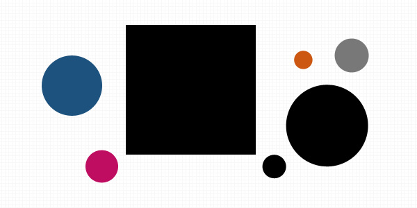
Imagine this diagram is your nonprofit's home page. The multiple circles and their relative complexity reinforces our desire to "classify" the objects in terms of relationships. Similarities and differences become the frame that your website visitors view the shapes through. Differences in scale suggest that one object is closer to us than another or that one is more dominant than the other; Variations in color might suggest that one object holds a unique personality that sets it apart from the other object.
A lot of information can be delivered in just a single image by using some very rudimentary visual hierarchy. In this case, the black square box may be a photo of someone in need of your services. Your eye goes there first, you feel emotion, then your gaze heads to the big black circle that has your tagline "help us support the homeless" and so on as the smaller objects have tiered callouts and actions for the user to take.
Quick and Easy Fix
Explore other websites and rank the elements in terms of visual hierarchy. Then review your nonprofit's website. Is there content (key information that visitors seek) too far down in the hierarchy? Make it more prominent in terms of importance to the information you want your visitors to consume.
3. Seek Closure
"You complete me." That would be music to the ears of any executive director when visitors came to their website. We innately seek completeness. When certain shapes that aren't closed or elements of a picture are missing, our natural perception fills in the visual gap. We see a circle and a square even though neither exists in the images below.

Using the law of closure can make logos or design elements more visually appealing. A good example is the World Wide Fund for Nature logo, which was designed way back in 1961. In this case, the design does all the work on its own, as the eye takes over to fill in the white space to create an image of the iconic panda.

Quick and Easy Fix
Review the images on your website from photos to graphics. Are they stale stock images? One quick fix is to delete sections of an image to help spark the creative side of your visitors' brain to piece it together and get further engaged in your story.
4. Face the Music
Pictures of faces give your nonprofit a special opportunity to guide your visitors attention. The "you look where they look" phenomenon.
Researcher James Breeze showed designs to 106 people to demonstrate the influence of well-positioned faces and their power to direct the observer's attention toward other elements.
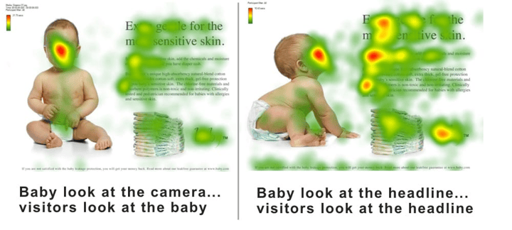
Below is a famous study with a baby face. When the baby looks at the headline, observers look at the headline. When the baby peers at the camera, observers look at the baby.
Quick and Easy Fix
Use a line of sight in face imagery as a directional cue to guide your nonprofit's visitors' attention to key calls to actions such as donating or downloading a form.
5. Use the Golden Ratio
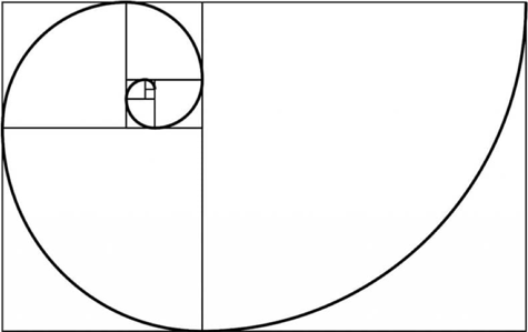
Designs that use proportions defined by the golden ratio are believed to be aesthetically pleasing. The Golden Ratio is the magical number 1.618 (φ). And let us not forget Fibonacci's magical sequence where each term is the sum of the two previous terms: 0, 1, 1, 2, 3, 5, 8, 13, 21, and so on. The amazing thing is that these two seemingly unrelated topics produce the same exact number.
Here's what the Golden Ratio looks like:
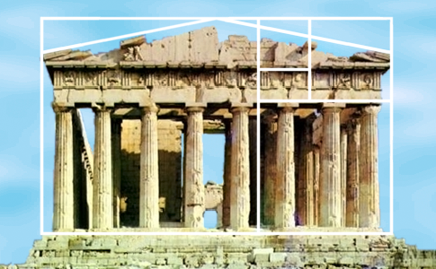
Many engineers and artists have used the Golden Ratio throughout history. A well-known example is the Parthenon from ancient Greece:
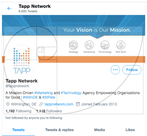
Can the Golden Ratio work for web design? Just ask Twitter.
Quick and Easy Fix
If your design layout width is 960 pixels, divide it by 1.618 (= 593 pixels). Thus the width of the content area should be 593 pixels and the sidebar 367 pixels. If the website height is 760 pixels, you can split it into 470-pixel and 290-pixel chunks (760/1.618 = ~470).
Get Started Today
Getting your feet wet in design is fun. Especially today, with so many content management systems, blogging tools, and design themes readily available, you can make many of these design fixes fast and easy. But truly mastering all of the facets of web design and connecting the dots to your marketing campaigns takes time and expertise. Understanding these basic principles of design will help you along the way.
About the Author
Joseph DiGiovanni is the co-founder of U.S.-based Tapp Networks, LLC. Tapp is a mission-driven digital agency that serves nonprofits worldwide seeking to accelerate their social impact through the latest advances in marketing technology.
Additional Resources
- Enroll in TechSoup Courses' Branding for Nonprofits Bundle.
- Take advantage of TechSoup's Website and Development Services.