Editor's note: CauseVox products are no longer available through TechSoup.
A nonprofit fundraising website is a tremendous opportunity to increase donations and build support for your cause. It can help mobilize your existing supporters, bring in new donors, and serve as the online center of your campaign.
There are a lot of options for how you want your site to look, and how you want it to work. For an effective website, make sure you include the following.
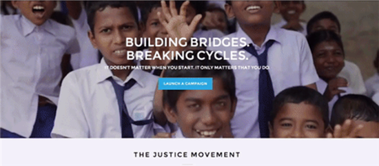
1. An Easy Way to Donate
Your storytelling and the look of your website are important, but your website isn't doing its job unless people know how to give you money. They shouldn't have to look for a special page or need to figure anything out before making a donation. It should be obvious. A great big button that says "Donate" is ideal.
Not everyone viewing your fundraising website is going to watch your video or read all your content. Some will only want to make a few clicks, support your cause, then get on with their day. That's why it's important to make sure that even if someone is merely glancing over the website, they see how to make a donation easily from any device.
2. A Simple Version of Your Mission
One of the great things about a fundraising website is that it's easy for your supporters to share it. They can post a link on their social media channels, or send the link to people they think will be interested in supporting you. This brings you in touch with people who may have never even heard of you before. What a great opportunity to tell them who you are!
Explain your mission in clear, simple terms. You probably don't need to include your entire mission statement, but you do need a tag line or short explanation of what your cause is and what you're doing about it.
3. Bite-Sized Pieces of Information
When making a website, it's tempting to include every detail about why your cause is great, every possible result of your programs succeeding, and all the reasons people should donate. Unfortunately, this leads to an overwhelming website that people have trouble paying attention to or navigating.
Instead of slamming your audience with information, break the information up into smaller pieces. Identify the key elements of your story and focus on them. There are many good ways to organize information, including
- Dividing your story into "The Problem," "Our Solution," and "How You Can Help"
- Creating a single sentence version of your campaign. For example: "X number of children in our community live more than X miles from a public library, so we're raising money to increase the library's mobile program to provide books to all children."
- Answering the questions who, what, where, when, why, and how?
4. Compelling Video
Strong visuals help people visiting your website see and understand what you do in a way that simply reading about it doesn't provide. Video currently is the strongest kind of visual to include on your fundraising website. It combines the impact of pictures with the power of words, a perfect match for making your story meaningful to viewers.
Your fundraising video doesn't need to be long or fancy. What it does need to do is tell a story about your cause and why it matters.
You can do this simply through
- Testimonials from people helped by your programs
- Interviews with experts, volunteers, leaders, or supporters
- Clips from the field of people working on your cause
5. A Direct Way to Get in Touch with You
Just because you're fundraising online doesn't mean you only exist on the Internet. Some donors may want to actually talk to you, particularly if they want to get involved with your cause, make a major gift, or learn more about you.
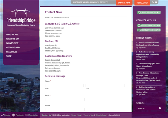
Make it simple for them to do this by providing a name and contact information for a real-world conversation.
6. A Next Step
Whether it's following you on social media or subscribing to your newsletter, give your new supporters something to do to keep in touch with you and stay updated on the campaign.
Continuing the conversation about your cause can transform a one-time donor into a person with whom your organization has a real relationship.
Time to Redesign?
If you're looking over your site and noticing you don't have some of these must-haves, it may be time for a nonprofit website redesign to make sure you're getting powerful, effective results for your cause.
About the Author
Noah Barnett is the growth marketing lead at CauseVox and host of the Rally & Engage podcast. Prior to CauseVox, Noah spent six and half years in fundraising and marketing leadership roles at World Help and The Adventure Project. He knows firsthand the challenges nonprofits face and is passionate about equipping them with the resources and insights they need to rally people around their cause.
Images: CauseVox