Reporting on various programs and projects is an integral part gauging the success of your nonprofit's activities. This exercise is crucial not only to internal stakeholders, but also to funders, donors, and the world at large.
Data visualizations are arguably the most effective way to translate large amounts of information into bite-sized pieces that are easier for others to digest. In fact, data visualization is the only way to convey certain data in a comprehensible way, such as those data that are found using heat maps (which we'll get to later).

Just as cooking combines various ingredients to create a memorable experience through a particular meal, data visualization can bring together many different pieces of information into a central — and memorable — format. These digestible pieces can be visualized through various tools, such as Tableau and Power BI and coding languages such as R or Python. But regardless of the chosen tool, data visualization can feel daunting. You might find yourself asking these questions:
- How and where should I incorporate data visualizations?
- How many charts should I include?
- Which ones should I use?
Let's address these questions and dive deeper into how you can craft the right recipe for your target audience, your data, and your nonprofit.
How to Incorporate Data Visualizations into Your Reports
Data visualizations break up the monotony of text and make your reports more insights-focused and data-driven. But it's important that you don't see the use of data visualizations as an "add-on" to your research (or, to use the cooking analogy — a garnish). Thinking about impact and measurement in terms of how you might visualize key data related to your programs should be part of your reporting process from the very start.
Data visualizations prevent your reader from becoming overwhelmed. Using them allows you to educate the reader and humanize the data by providing context and insights through a story — as opposed to long lists of facts and figures. But this narrative, as told through your visualizations, should still be supplemented with text.
This combination will help transform complex topics into something more comprehensible — and enjoyable — for the reader. So, rather than a garnish, data visualizations are more like key ingredients that are necessary to make your "meal" more palatable.
For example, at the end of the year, you'll probably need to communicate all that your organization has achieved over the past 12 months. Instead of describing a lengthy list of the programs you offered, the cities in which the programs were offered, and how many people accessed those programs, you can, instead, create a map with this data. The map could have a dot placed in the location where programs were held with the color of the dot representing the different types of programs offered and the dot size representing the volume of people who attended.
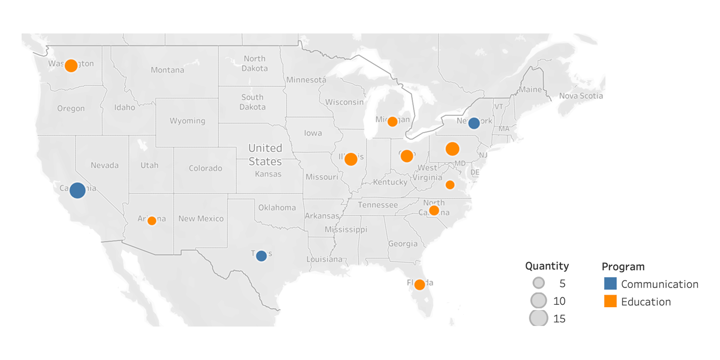
These types of visualizations help walk the reader through your findings and support the related text. They also keep the report condensed, while still highlighting key information. For general reports, a best practice might be to include two or three visualizations such as these. This should be enough to highlight information without becoming visually overwhelming for the audience. It is important to note that a new chart should only be included if the information being conveyed cannot be combined in a previous chart using techniques such as color coding or sizing representations. Each additional chart should provide additional value in order to avoid redundancy.
How to Select Which Visualization to Use
Data visualizations are the key ingredients in your recipe. But what flavors should you use? When visualizing data, you should select the charts that best fit the data being visualized, as well as what they should communicate to the reader. One of the important questions to ask yourself is, "What is the story I want to convey?" Once the key takeaways are identified, selecting the best method to communicate them becomes easier.
When selecting the correct visualization, keep in mind how many variables are being conveyed, the amount of context your target audience requires, and the insights you wish to illustrate. You will not be able to communicate everything through visualizations; therefore, realistic expectations should be made about what are the most important aspects.
Bar Charts
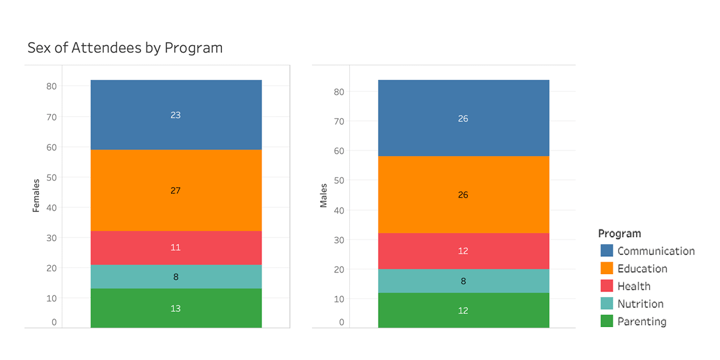
The most simple and effective charts to use are bar charts. They are ideal for data that has both numerical and categorical values. For instance, bar charts can be used to show the distribution of data, such as the diversity of the people attending a program. With such a chart, you can more easily pinpoint the demographic not being targeted and adjust accordingly. Bar charts are also very easy to convey multiple variables in one chart since they can be stacked or color-coded for side-by-side comparisons. One such example can be seen below, in which bar charts are used to compare the number of females and males who attended five distinct programs (note: all of the examples below feature data generated for a "generic" nonprofit).
Maps
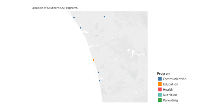
If your data contains any geolocation information, maps are the most effective way to communicate such information. A map can be used to represent both specific data points and aggregated data. Maps can be used to highlight the specific number of programs offered in a given zip code, as well as an average number of programs per zip code. The image below shows a collection of programs our sample nonprofit offered in Southern California and clearly highlights the lack of diversity of such programs. Now stakeholders will be able to use these insights when deliberating which type of programs to provide going forward.
Pie Charts
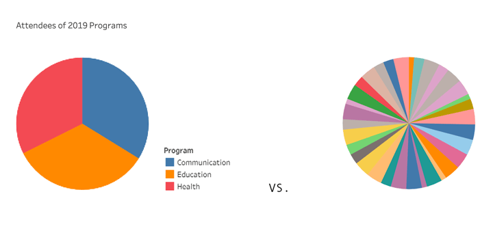
One of the most frequently used visualization tools are pie charts. However, pie charts are also frequently used incorrectly. They are only ideal for information involving data with small variation — generally, three or four categories (left image). Pie charts should not be used to convey data that has too many categories, since the smaller the slices become, the more difficult it is to distinguish differences or trends (right image). If your organization offers three to four different types of community programs and you wanted to convey the attendance to each program type, then a pie chart would be acceptable. However, if you host 20 events a year, your audience would have greater difficulty understanding the attendance breakdown via a pie chart.
Line Charts
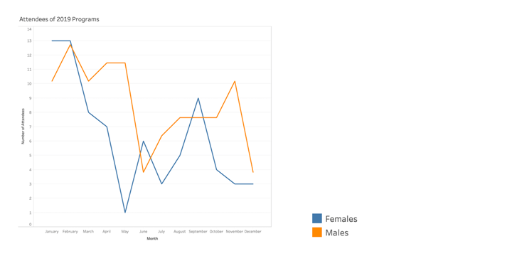
Line charts are excellent tools for data involving time, particularly long periods of time. They are ideal for illustrating changes in data, such as a positive growth trajectory or a negative declining pattern. Such visualizations are best suited for numerical data and data collected frequently over a given time period. Below, the line chart allows us to more easily see trends in attendance to our nonprofit's events in 2019. For instance, we see that attendance begins high in the early months of the year for both males and females but then drops significantly around June.
Dual Axis Chart
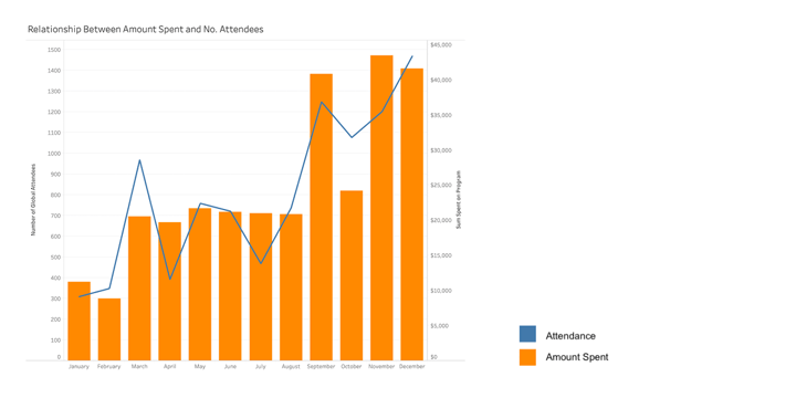
When you have three different datasets and want to show a relationship between them, dual axis charts are the best method to do this. They are optimal for datasets with two numerical variables and one categorical variable. For instance, this chart can be used to compare both the total number of attendees to a workshop and the total amount spent on that workshop on either y-axis, grouped by month on the x-axis. It will show the correlation between attendees and amount spent. In this case, the number of attendees increased as the amount spent also increased.
Heat Map
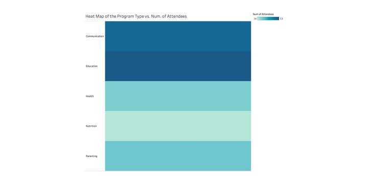
Heat maps are ideal mechanisms for displaying correlation among many data elements. These use varying colors or saturations to illustrate a scale of correlation from low to high. A best practice for heat maps is to select a single color, such as blue, and simply vary the color in saturation to illustrate the range from low correlation, light blue, to high correlation, dark blue. It is important to note that heat maps make comparing correlations on either side of the extremes easy, but they can make it difficult to compare correlations that are similar since the saturation of the colors will also be very similar.
As illustrated below, It is easy to see that there is a greater attendance to the education-centered programs in comparison to the nutrition-focused ones. However, it is challenging to see how much of a difference in attendance there is between the health and parenting programs.
Bubble Chart
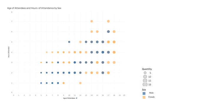
A scatter plot is a chart that displays data points as dots on an x- and y-axis. Bubble charts are very similar, but add a third element — the size of the dots. Instead of having numerous data points of the same value, the points are combined and represented by the size of the dot (bubble) instead. Thus, bubble charts are great solutions for combining two to three different data types. A real-world example includes plotting the age of attendees by the total number of workshop hours attended and then color-coding the bubbles to show the relationship by gender. It will help you identify and show otherwise confusing trends in a manner that is better understood by your reader.
Key Takeaways
Data visualization is a powerful tool that can elevate your reports, make them more engaging, and convey much more information than text alone. Regardless of the tool that you use to create them, charts will help better portray the story within your data. Thus, it is imperative that you select the correct charts based on your data type and the key insights you wish to highlight.
Remember to keep visualizations clean, clear, and concise in order to maintain the bite-sized attribute. As the "chef" of your report, you need to keep the flavors of your meal complementary to one another and avoid cluttering things up too much. Pick just the right number of visualizations — those that best support your findings in the most comprehensive ways — and make sure that they shine through in relationship to your overall narrative.
Using data visualizations in the right way will make your report a "meal to remember." So don't cut corners during the planning process, make sure that you have all the ingredients you need, and create something that people will want to share with others.
Additional Resources
- Sign up for the TechSoup Courses series Power BI for Nonprofits.
- Learn how to Power Up Your Organization's Data with Microsoft's Power BI.
- View a webinar on how to Harness the Power of Data with Tableau.
Top photo: Shutterstock
