
At some point, all nonprofits seek to tell their story of impact. However, some stories can resonate quicker than others by identifying their community impact with metrics, with the idea of engaging readers faster. Other stories do the job, but they are sometimes missing the edge that could lead to more of what you're really asking for: things like donations, volunteer time, and help with the board.
One common thread throughout successful storytelling by nonprofits, NGOs, community service organizations, libraries, and schools is the incorporation of data. All of your stories do not need to include great and amazing numbers and metrics at every turn, but where you can plug in your impact, you can stand out. This is data-driven storytelling.

Why Is Data-Driven Storytelling Important?
Introducing data into your messaging provides evidence that your cause is urgent and needs support. Communicating your metrics can help drive towards donations, volunteers, or other engagement goals.
Using data is a marketing communications tactic that enables your audience to see how your cause is making an impact through creative storytelling. Most importantly, it helps your cause, and the main messages you want to convey, really stand out.
Three Ways to Get Started
1. Collect the Data
Get started by taking a look at your nonprofit's accomplishments over the last year. You have some data available, so lay it all out in front of you and decide what metrics are relevant for the stories you might want to tell, or how you can weave all the numbers together to tell a story. You don't have to know the full story yet, but if you do, you'll know what you're looking for when you find it, and you can move faster.
2. Pick Out the Big, Bold, Impressive Numbers
If you can find the metrics that show your greatest impact, those are the proof points you need to win over prospective donors or your next wave of volunteers.
Let's say a communications director is tasked with writing a series of stories showcasing impact for an upcoming annual report. To build stories of impact around that data, take a look at your easier-to-find top-level metrics first, such as
- How many people you have impacted or helped serve
- The number of volunteers you have
- How much money you raised, broken down by program
Then you can look at a second level of metrics, which are harder to measure and track. These could include
- The time spent by your professionals and volunteers helping the community
- The time spent on specific projects helping people
- Number of corporate donor employees engaged in your cause
The more you can find unique metrics for your communications department to make your brand stand out to potential corporate donors, for instance, the more your marketing assets have a chance to look and feel different and get noticed faster.
3. Just Start Writing
You've collected all your data, and now simple text can help form a story from the perspective of those benefiting from your cause. Don't overthink it: you have great data. This could be a five-sentence headline you intend to be an Instagram post or a 250-word story of impact. If you know that data benefited someone from countless hours of volunteer team work, a written story can become your case study showing how your nonprofit spent an average of x hours every day helping people, and it yielded y.
Not all of the storytelling has to be in written form. You can also create graphics as mentioned, and if you're really creative, find ways to break them into bite-sized pieces and promote as a series over and over, like on social media.

Three Marketing Channels to Tell Your Story and How Other Nonprofits Did It
To bridge the narrative and the numbers, here are three ways a nonprofit can include data in its storytelling and bring it to life. These examples are noted for their strong and creative visuals that grab stakeholder attention fast, including some yearly reports from customers of Yearly.
Annual and Impact Reports
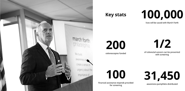
The Colorectal Cancer Alliance is on a mission to let everyone know that colorectal screening saves lives and that everyone is vulnerable, but even as one of the biggest killers every year, it is preventable if caught early. They focused on one campaign's results in the form of big, bold numbers. They led with "100,000 Lives Saved," and if that does not grab the attention of a potential donor, I am not sure what will. You can see their full digital report built with Yearly here, with this data in the second section.
Videos
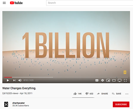
charity: water is a nonprofit that is communicating that there are 1 billion people without clean drinking water. Their Water Changes Everything campaign includes a video with this metric. While this is a high-quality video, since 2011, social media has made it commonplace and acceptable to have even lower-budget videos published. You can use that opportunity to create them yourself or ask brand ambassadors to make and post them, such as those that support your cause. You can even hire freelancers through websites like Fiverr who can help, on a budget.
Social Media Posts
Operation Lifesaver communicates that crossing railroad tracks is dangerous. To do so, they take to social media with key metrics to help make their plea to pay attention stand out. In this post, they convey the message that more than 20 percent of crossing collisions involve large trucks. They could have just said that idea without the metric, but that might make those driving, and driving near trucks, pay more attention, because 20 percent is a relatively large number. They designed this post to have the metric draw you in, and the call to action be an educational guide that their audience can access to learn more.

Other creative ideas include incorporating newsworthy data into press releases, and designing infographics that take several data points and tell a story. The more you can divide up all your metrics to tell a consistent story over time as a social media series, the more reach and longevity you can create for your audience, by telling a story with data over time.
A robust data-driven story strategy is important for all nonprofits so that you can maintain a consistent narrative, stand out to potential donors, and get noticed fast by media outlets that can help spread the word.
All nonprofits have data and a story to tell, and how you communicate it is up to you. Using data-driven storytelling is one great way to make sure yours stands out.
About the Author
Josh Kligman is the co-founder of Yearly, a drag-and-drop report builder tool for nonprofits to create digital reports. Josh has 20 years of marketing and sales experience and has been helping nonprofits with marketing and annual reports since 2011.
Additional Resources
- Check out Tech Soup Courses' Nonprofit Data and Impact Measurement Mega-Pack.
- See a webinar about How to Collect, Analyze, and Share Program Impact Data.
- Find out about Tools to Collect and Analyze Field Data.
- Learn how to Create Inspiring Fundraising Videos with Adobe Premiere Rush.
- Explore resources for becoming a storymaker.