Yearly is a digital report builder that allows you to design reports that are easy to understand and fun to read and that display your most important updates in an accessible way. Here we have gathered a few of our favorite features Yearly offers and some of the ways you can use them in your reports.
Features Built for Better Reports
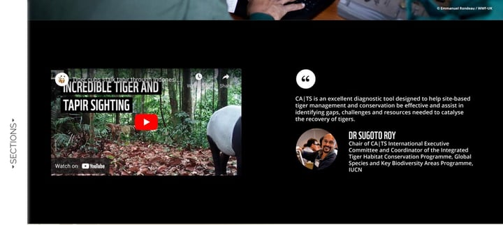
Yearly includes a range of useful features that make your reports better for your readers, and easier to create for your team. For example, you can embed video and social media content right into the body of your report. This means that you can show interviews, site tours, or Instagram posts without needing to jump to an external link. Visual content is a great way of shaking things up and engaging your audience, and embedding it within the report helps to create a sense of continuity.
Yearly also allows you to upload your own fonts, images, color schemes, and logos to the platform. Keep your report recognizable and in line with your brand by ensuring that you carry your branding and style guides across to your annual report. There is also an option to remove the Yearly branded footer in your report, which may help it to appear more professional.
Having your report as a downloadable document may discourage people from reading it. Yearly offers you an embed code, which means that your report can live on your site. This makes it more accessible and removes a barrier to people finding out more about your organization.
Make the Basics Better
Yearly includes some clever elements and visualizations that nonprofits can use to showcase their impact. These are all contained within a central toolbar that you can use to choose and edit the elements you want to include.
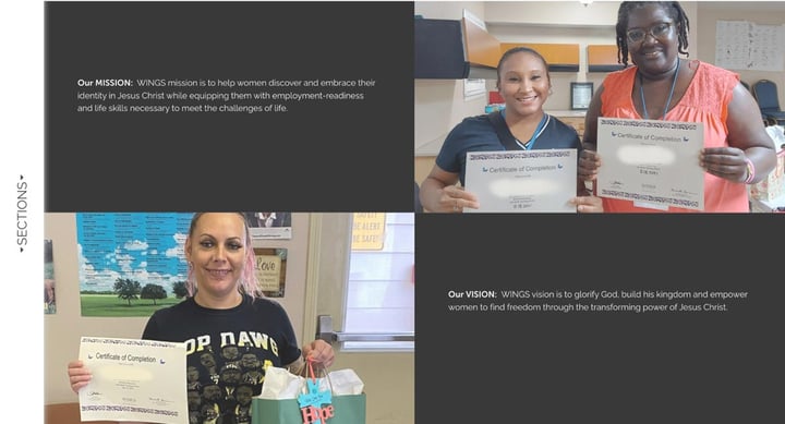
The Story feature helps you to showcase images and information in an engaging way. This can be used to explain the origins of your organization, a client success story, or the process of expanding to a new location.
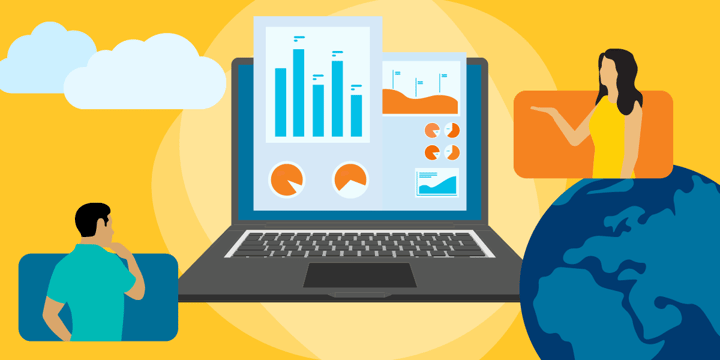
Statistics can be a dry and difficult-to-understand element of a report. Even the most impressive and exciting numbers can lose their impact if they aren't given the context and presentation they deserve. Yearly includes helpful layouts and visualizations that can help your viewers to understand the meaning behind the stats you are sharing and what they say about your organization's work.
On a similar note, we all have to talk about money in our annual reports, but these sections are not usually very exciting. You can use Yearly's visualizations and other graphic elements to convey the important information without overwhelming or boring your viewers.
It's important to acknowledge your donors and supporters. You can do this through Yearly's ready-made thank-you page templates. You can also encourage prospective donors to give by including a direct link to your donation form within the report.
Level Up Your Reports
Yearly can be used by all nonprofits to improve the appearance, accessibility, and functionality of their annual reports. Give your stories, statistics, and plans for the future the presentation they deserve and encourage more people to support your work. On Yearly's website, you can find plenty of inspiration in the form of examples of other organizations' annual reports, which are a great place to start if you're stuck for ideas.
In partnership with TechSoup, Yearly is offering U.S. organizations with an annual budget of less than $2 million a 50 percent discount on its Pro and Premium plans. Find out more about Yearly and try it out when you create your next report.
Additional Resources
- Learn more about How to Use Data to Tell Your Story.
- Enroll in TechSoup Courses' Nonprofit Data and Impact Measurement Mega-Pack.
- Check into a TechSoup managed IT services plan.
- See a webinar on How to Collect, Analyze, and Share Program Impact Data.
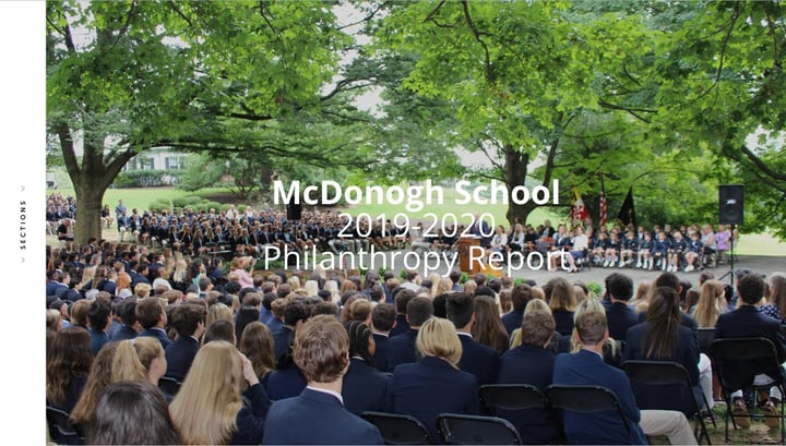
Top photo: Shutterstock