
The future is a visual one. These days, people often share images that communicate a wealth of nuanced information (rather than relying on words), and visual literacy is becoming a requirement. Given this new reality, how can we communicate with and engage our communities?
Meggan Frost, public services librarian for Paul Smith's College in upstate New York, gave a knockout presentation on graphic design recently for the Nebraska Library Commission. She explained that when something is designed well, it makes us want to get closer to it. It makes us pay attention.
She offered four fundamentals of graphic design to guide us in creating materials that will engage others, as well as three useful shortcuts — plus some bonus information on how to find inspiration.
Here are Meggan's tips on the four fundamentals of graphic design.
1. Layout: Ask Good Questions About Your Design
When you're setting up your layout, ask yourself the following questions:
- What does this need to do?
- What are my constraints?
- How will I organize the information? (What is the hierarchy?)
- What is most important?
- How will I show importance? With color, texture, placement, or size?
- Does the flow make sense?
- Is it clear?
- What isn't needed?
Since it can be really paralyzing to stare at a computer screen, you could try making a really rough sketch on paper of where the elements could go. Then go to the computer and put them in. Print your draft and take a step back. Ask yourself the questions again.
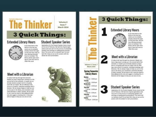
Make improvements, and repeat as necessary. The above image shows an example of Meggan reworking a newsletter layout: on the left is her first effort; on the right is the final product.
2. Color: How to Figure Out Which Colors to Choose
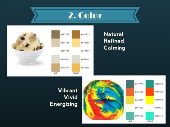
A color palette can be natural, refined, and calming, or vibrant, vivid, and energizing. Meggan recommends choosing no more than three colors plus black and white: a limited color palette will actually do great things for your design.
Here are some awesome free tools to help you with color.
- A browser add-on called Colorzilla — Use this to pick up colors using an eyedropper tool on a web page of interest.
- DeGraeve — Enter the URL of an image, and DeGraeve will give you a color palette (in two versions: dull and vibrant).
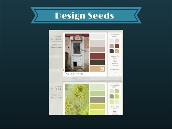
- Design Seeds — Use this for inspiration. It gives you many choices of an image and a matching color palette.
3. Images: Where to Find Good Ones
Meggan's favorite sites for getting free imagery include
- Flickr — Includes lots of cool vintage photos. Search for Creative Commons-licensed images.
- Google — Use the filter that allows you to search by license type to find images you can reuse.
- Morgue File.
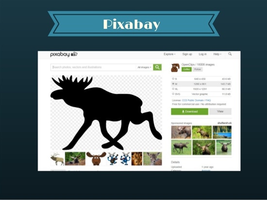
- Pixabay — includes vector images, which can be resized without using quality. Take advantage of those with transparent backgrounds (which are indicated with a checkerboard pattern).
- The Noun Project — Use this site to find lots of great icons that you can add to photos or designs.
Also see TechSoup's blog post on top 10 sources for free images.
4. Fonts: Tips and Tools
Again, less is more! Meggan recommends that you use two, or three maximum, fonts that are demonstrably different from each other. Here are some of the tools she likes to use for fonts:
- 1001 Fonts — You can preview your text with the font before downloading it, saving you time and avoiding frustration.
- DaFont — It's got lots of good dingbats, which you can use to add stuff like nifty swirls or curly arrows to your design.
- Typewolf — It gives examples of fonts "in the wild" and tells which fonts they are. It also shows you how to mix and match fonts.
3 Quick Design Shortcuts
In addition to teaching these four fabulous fundamentals of graphic design, Meggan provided three great shortcuts (tools you can use to up the caliber of your designs). These include
- PicMonkey — A very robust image editor that you can use to create collages or adjust images. It also includes themes that you can employ to make a picture of yourself look like a vampire or a zombie.
- Canva — A design website offering all kinds of templates, for instance, a presentation template. About half the stuff is free, but she's always been satisfied with the free stuff.
- Infographic generators — Meggan likes Easel.ly and Piktochart.

Sources of Inspiration
Where do you get your ideas? Many artists like to keep a collection of some sort that reminds them of concepts or designs they really like, so that they can use them later as a source for inspiration. It's a time-honored tradition to take a sample as a starting point and modify it to create something new, or related but different.
Meggan sets aside some time to save things she thinks have good design. She stores them on Pinterest, another good place to look for color combinations or palettes, even if you don't have an account.
She also recommends the blog Librarian Design Share for ideas on how other people are communicating.
Her favorite places to learn about design include
- Lynda.com — It offers discounts for nonprofits.
- Canva — It has a free design school website and blog.
- Creative Live and Skillshare — These are not free, but if you get on their mailing lists, you will get special offers including free classes. Designers use these sites to brush up on skills and learn from the masters.
Images: Meggan Frost